How Professional Booklet Printing Elevates Your Marketing Materials
The Value of a Well-Crafted Booklet
When I started working with small businesses and nonprofits in Lancaster, one of the first things I noticed was how often they relied on the same tired flyers and brochures for every event or pitch. A flyer works for a quick announcement, but for anything that asks for real attention, a portfolio, a training manual, an event program, a booklet is a different animal. It has weight, it has structure, and it tells a story in a way a single sheet can't. That's where professional booklet printing becomes more than a production step; it becomes a strategic choice.
I've sat in on design reviews where someone would hold up a saddle-stitched booklet and say, "This feels like something from a real company." And they were right. The tactile difference matters. The way the pages turn, the way the cover resists bending, the way the ink sits on the stock, all of that communicates care. If you're printing a training manual for a team of new hires or an event program for a Lancaster arts festival, the print quality sets the tone before anyone reads a single word.
Understanding the Basics: Binding, Paper, and Finish
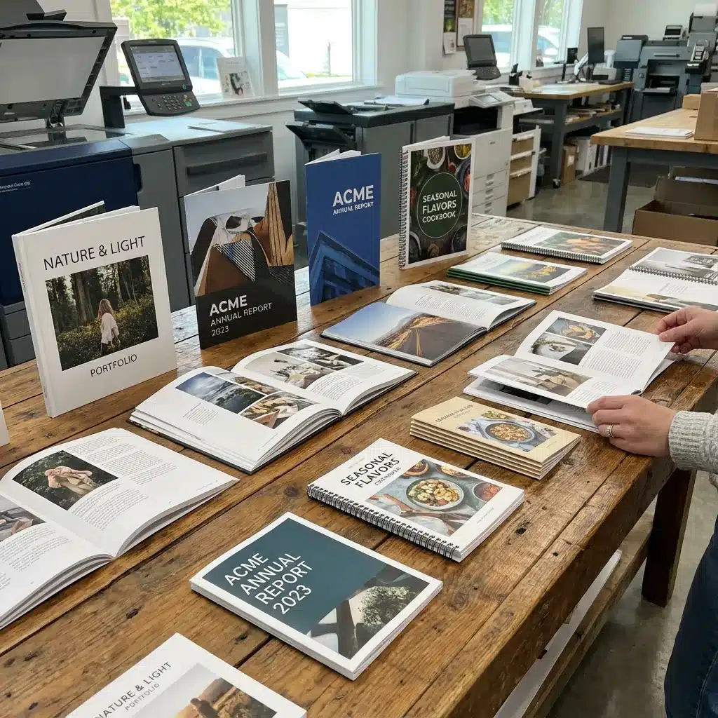
Before you send a file to press, you need to decide how the pages will stay together. The most common options are saddle stitching and perfect binding. Saddle stitching is what you see in most small magazines and thin catalogs. Staples along the fold line hold the pages, and the booklet opens flat. It's cost-effective for runs under about 48 pages, and it works beautifully for event programs and short marketing booklets. Perfect binding, on the other hand, uses a glue-based spine, the same technique used for paperback books. That gives you a flat spine that you can print on, which looks more substantial on a shelf or a desk. It's the right choice for a portfolio or a thicker training manual where durability matters.
Then there's paper weight. I've seen people try to save a few cents by choosing a light text weight for the cover, and it always backfires. A flimsy cover gets dog-eared in a bag within a day. A good rule of thumb is to use a cover stock of at least 100 lb text or 80 lb cover, and for the inside pages, 70 lb to 80 lb text. That gives the booklet enough body to feel substantial without being heavy. If you're printing a portfolio or a marketing booklet meant to impress, consider a heavier cover stock with a matte finish. The matte finish reduces glare, makes colors look more subdued and elegant, and hides fingerprints well. For a more vibrant, eye-catching piece, say, a product catalog or a photo-heavy event program, a glossy finish makes colors pop and gives images a sharper, more saturated look.
Getting the File Ready: Bleed, Trim Size, and Color
One of the most common mistakes I see in files sent to print shops is the lack of proper bleed. Bleed is the extra area outside the trim size, typically 1/8 inch on each side, that ensures your background colors or images extend all the way to the edge after cutting. Without it, you get a thin white border that looks amateurish. Always set up your document in InDesign or whatever layout program you use with the correct bleed margins from the start. It's much harder to add bleed after the fact than to build it in.
Trim size is another detail that trips people up. A standard booklet might be 8.5 x 11 inches or 5.5 x 8.5 inches, but you can choose any size that fits your content and budget. Just remember that non-standard trim sizes may require custom die-cutting or more waste, which raises the cost. For a training manual or a portfolio, a standard size keeps things simple and affordable.
Color is another area where experience pays off. Most commercial printers use CMYK for full-color projects. If you design in RGB, the colors will shift when converted to CMYK, and that shift can be dramatic, especially for brand colors. I always tell clients to design in CMYK mode from the beginning, or at least proof their files after conversion. And if you're sending a PDF, use the PDF/X format. It embeds all the fonts, flattens transparency, and sets the color space consistently. Printers love receiving PDF/X files because they reduce the chance of errors at the RIP stage. A good Heidelberg press will reproduce those files with stunning accuracy, but only if the file is clean.
Matching the Binding to the Purpose
I mentioned saddle stitching and perfect binding, but spiral binding deserves a mention too. Spiral binding uses a plastic or metal coil that goes through holes punched along the spine. It allows the booklet to lie completely flat when open, and pages can turn 360 degrees. That makes it ideal for training manuals, cookbooks, or any reference material where the user needs to keep their place or fold the booklet back on itself. The downside is that it's more expensive per unit than saddle stitching and not as common for short runs. But for a high-use item like a training manual, the extra cost is worth it.
For marketing collaterals, I usually recommend saddle stitching or perfect binding depending on page count. A 16-page product catalog with a glossy cover and saddle stitching feels lean and modern. A 64-page portfolio with a matte finish and perfect binding feels like a serious book. The choice says something about your brand. A cheaply bound booklet with a thin cover suggests that the content inside might not be worth careful attention. A well-bound booklet with a sturdy cover and professional finish suggests the opposite.

Practical Examples from the Field
I worked with a local nonprofit in Lancaster that needed an event program for their annual gala. They had used a simple flyer the year before, but this time they wanted something that would serve as both a program and a keepsake. We chose a 5.5 x 8.5 inch trim size, saddle stitched, with a 100 lb cover stock and a matte finish. Inside, we used 80 lb text with a subtle cream tint. The design was clean, with generous margins and a single spot of color for headings. The result felt warm and substantial, exactly the tone they wanted. People actually kept the programs, and the organization used leftover copies as promotional pieces for the next year.
Another client, a photographer, needed a portfolio to show at client meetings. She had been using a digital tablet, but she felt that printed pages created a different kind of connection. We went with a landscape-oriented booklet, 9 x 6 inches, perfect bound, with a lay-flat cover and a matte finish. The paper weight was 100 lb text for the cover and 80 lb text for the inside. The images looked vivid without being glossy, and the book felt like a premium artifact. She told me later that the printed portfolio closed more deals than her tablet ever did.
Balancing Cost and Quality
Professional booklet printing doesn't have to break the bank, but you do have to make trade-offs. If your budget is tight, you can cut costs by choosing a smaller trim size, using a lighter paper weight for the inside pages, or opting for saddle stitching instead of perfect binding. But I would never recommend cutting corners on the cover stock or the finish. Those are the first things a reader touches. A flimsy cover or a cheap glossy finish that feels sticky can undo the credibility of even the best content.
I also suggest ordering a physical proof before committing to a full run. A digital proof on screen can't show you how the paper feels or how the colors look under different lighting. A printed proof from the same press that will run your job, ideally a Heidelberg or similar quality press, gives you a true representation. It costs a little extra, but it's cheap insurance against a whole batch of booklets that don't look right.
If you're based in Lancaster, you have the advantage of working with a local printer who can walk you through these decisions in person. You can bring in samples, discuss paper options, and see the press sheets while the job is running. That kind of support is hard to get from an online-only print service. It also means you can adjust the design on the fly if something doesn't look right on the proof.

Final Thoughts on Making It Work
At the end of the day, professional booklet printing is about creating a piece that people want to pick up and read. That means paying attention to every detail, from the bleed and trim size to the binding and paper weight. It means choosing between a glossy finish for punch or a matte finish for elegance. It means thinking about how the booklet will be used, whether it's a training manual that will be flipped through daily or a portfolio that sits on a desk and gets opened during meetings.
When you get it right, a booklet can do what a flyer or a brochure can't: it can hold someone's attention for more than a few seconds. It can tell a complete story. And it can make your brand look like it belongs on a shelf next to the best in your industry. That's the real value of professional booklet printing, not just the ink on paper, but the message that the ink on paper sends.